0
 Dec 1, 2025
— https://sf.gl/2163
Dec 1, 2025
— https://sf.gl/2163
Making osTicket Somewhat Acceptable on Mobile
TL;DR: Copy the HTML and CSS at the end of this post to your osTicket installation to make it somewhat acceptable on mobile.
I've been using osTicket for years. It's a pretty neat ticket system, and does pretty much what you want.
But since the osTicket administration interface expects you're at your workstation, the entire interface is wonky when viewed on your iPhone. You have to scroll and zoom and buttons are invisible. Click targets are small, or out of reach. When you click on a textarea, the entire screen zooms in, preventing you from viewing context, or even what you've entered. Things like that. It's not mobile friendly, and I couldn't find an app that works nicely.
Luckily, it's quite simple to fix this with a few lines of CSS and a meta tag. No need for a mobile "responsive" theme. You can just add this code to your osTicket installation, and voila. It's not the pinnacle of UI design, but it's better than nothing for when you're writing a quick answer while standing in line at the bakery.
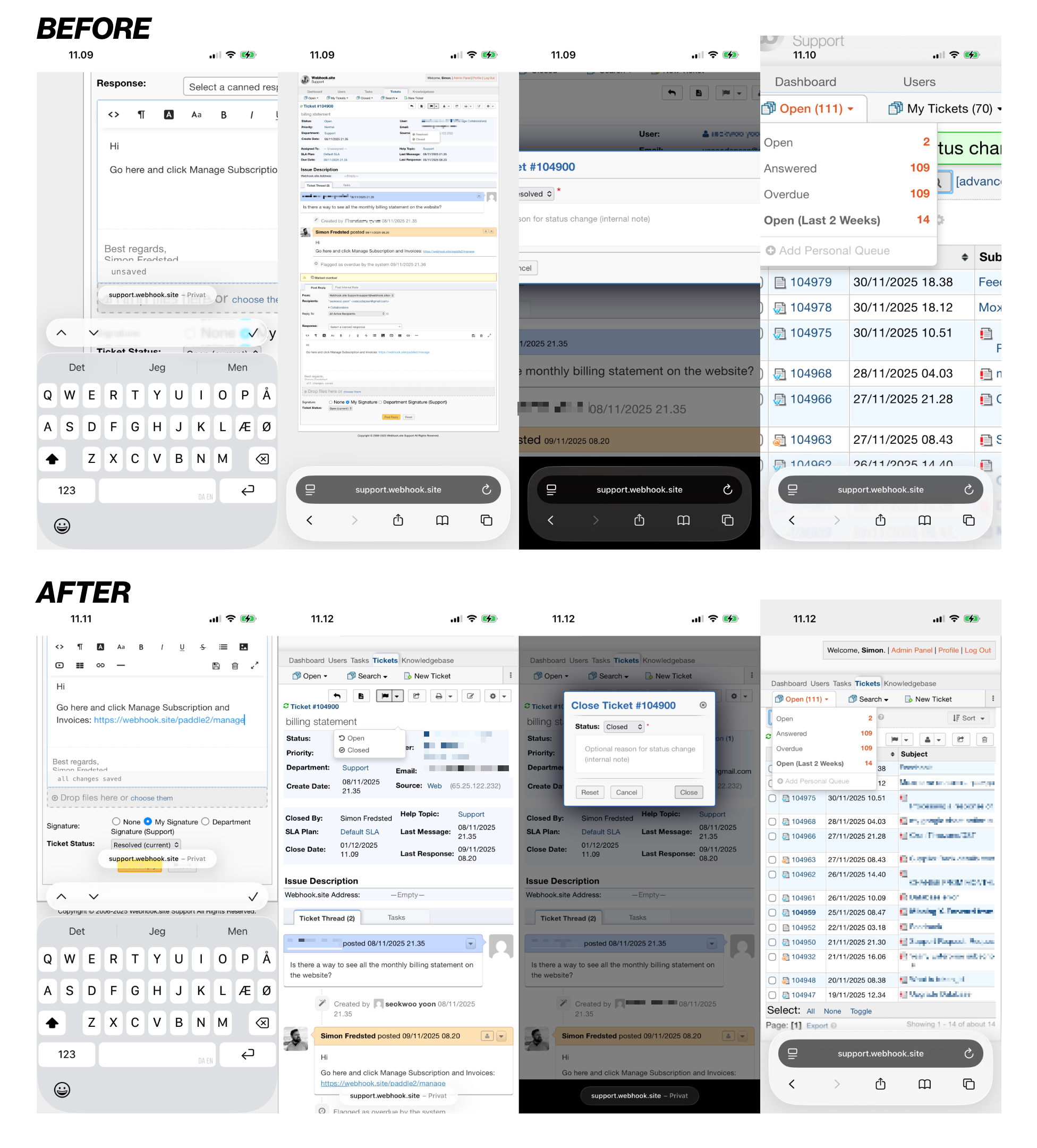
Before and After
Here's roughly what it does:
- Sets the viewport and zoom to something that's mobile friendly
- Removes the default 960px page width
- Removes redundant space from menu items and tables
- Sets better default sizes for text boxes and modals
Insert this snippet in include/staff/header.inc.php, preferably around line 26, after the last <meta> tag:
Next, add the following lines to scp/css/scp.css, line 1: